SMARTSHEET
Enabling 100+ designers & developers to ship cohesive experiences faster
Shipping solutions was inefficient. Misalignments between the design and dev teams were common and the user experience lacked end-to-end cohesion. I enabled 100+ colleagues to ship at scale, while reducing repetitive design effort by 2-3x.
ROLE
Sr. Product Designer
YEAR
2018-2020
TEAM
Fullstack & QA Engineers
Design Leadership
Product Manager
UX writer
→ 2-3x increased speed of execution
The component library and documentation enabled designers to spend less time pushing pixels and more time solving user needs.
→ 100+ colleagues: 1 source of truth
The design systems enables our team of 100+ designers and developers to implement designs more confidently.
→ 2-6x fewer color tokens
A major style guide cleanup gave teams more clarity than ever before—boosting confidence and focus. Proof that less really is more.
“Thank you for your truly excellent work building the design pattern library! This will help the entire team be more efficient and will have a huge impact in delivering high quality, consistent user experience for our customers! Not only did you exceed our expectations, but your positive, can-do attitude and ability to juggle your "day job" with this additional responsibility was very much appreciated.”
Kit Unger - Director of User Experience @Smartsheet
Everyone was wasting time
When I joined Smartsheet, designing experiences for our customers was cumbersome—lots of outdated files, constantly having to ask developers for basic details, and manually recreating common UI elements.
20-30% of designer and dev time was wasted because of foundational misalignments leading to unnecessary chit-chat.
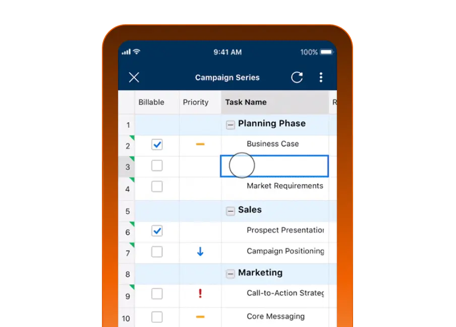
When working on the new mobile spreadsheet experience, I constantly had to hunt for the latest source of truth:
“Is it the right blue?”
“Do we use this font size in the product?”
“Is this component still being used?”
So, on top of my product design job, I led the initiative to increase the team’s velocity and output quality.
I built the iOS and Android style guides and component libraries.
In need of a strong foundation
The foundation—icons, colors, typography, and spacing—was as strong as WiFi signal in the mountains. ⛰️
Over 70% of icons had issues:
Tons of duplicates (which one is the latest one?)
Only available as PNGs (vectors, anyone?!)
Bad naming conventions made chasing the ‘right’ icon a chore
Inconsistent container sizes
Messy folder structures
We also had 60+ grays, and just as many blues—it’s that kind of story.
And it wasn’t just grays and blues. We had enough tints and shades to publish a book on color palettes.
The foundation had to be revamped.
Getting cross-functional buy-in
Developer buy-in was crucial for aligning the design and dev teams, especially with the mobile team starting a major redesign.
I met regularly with the iOS and Android Lead Engineers to address key parts of the project, including consolidating colors and tokens, simplifying icon folder structures, and standardizing the type ramp, etc.
This early collaboration made the project successful.
This allowed me to build a style guide and icon library aligned with the codebase, making future collaborations a breeze.
With the foundations taken care of, I started building the component library.
Early success led to new responsibilities
Mobile designers no longer had to rebuild every UI element from scratch or copy/paste them from outdated files.
The shared understanding between designers and developers enabled shipping mobile solutions without being bogged down by foundational details.
Designers designed 2-3x faster and more consistently.
I pitched the benefits to the broader design team, and leadership had me lead the design system implementation for the desktop app.
I had 6 weeks to complete the V1 of the web counterpart.
Getting started: Categorizing & recording
Getting started on the web design system was daunting. How to decipher a mountain of information?
Take a massive amount of screenshots to document the end-to-end experience.
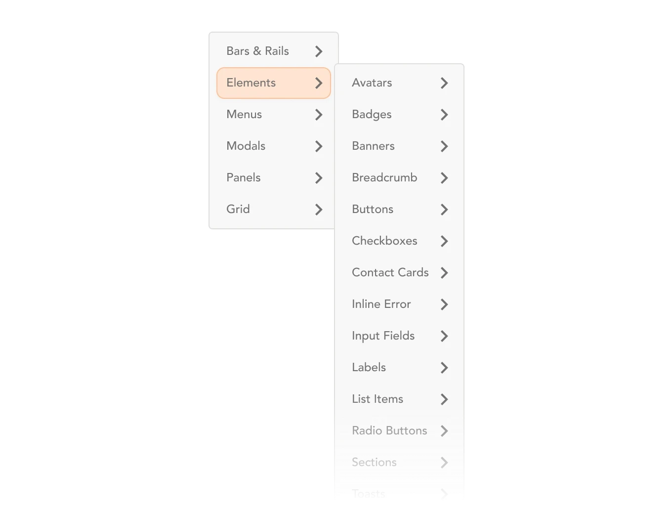
Start a spreadsheet to categorize 100s of items, patterns, components (e.g., modals, panels, views, bars & rails), etc.
Easier said than done! At that time, parts of our product were built using legacy components and other parts were refreshed. I had to over-communicate with various teammates to grasp it all.
Breaking down the UI to the smallest atom
At this point, and to all Brad Frost’s Atomic Design fans reading this, I had a solid list of all the atoms, molecules, and organisms: avatars, buttons, input fields, labels, etc.
I worked closely with my PM and developers to squash bugs that impacted the user experience and addressed BETA user feedback.
Although it wasn’t a perfect 7 out of 7, the great news is that most of the lower scores were due to areas outside the project’s scope: Lack of native Forms, poor Card view and Home experience.
We were confident the app was ready.
Building the component library
When building the component library knowing the audience (our team of designers) was essential:
How might I name components to simplify search while aligning with the code base naming conventions?
How might I create components that are easy to edit?
How might I display the right amount of component properties?
How might I reduce the need to detach components?
Knowing the ins and outs of the design tool is a MUST.
But having conversations with designers and developers is even more important. Seeing how they interacted with the components and getting their feedback was crucial.
I was lucky to work with some really talented people who took craft seriously—it helped tremendously.
Educating and sharing the knowledge
A style guide and component library alone are not a “design system.”
Documentation and education are key pillars for the product team to adopt the system and to use it correctly.
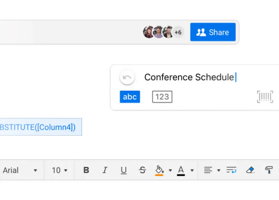
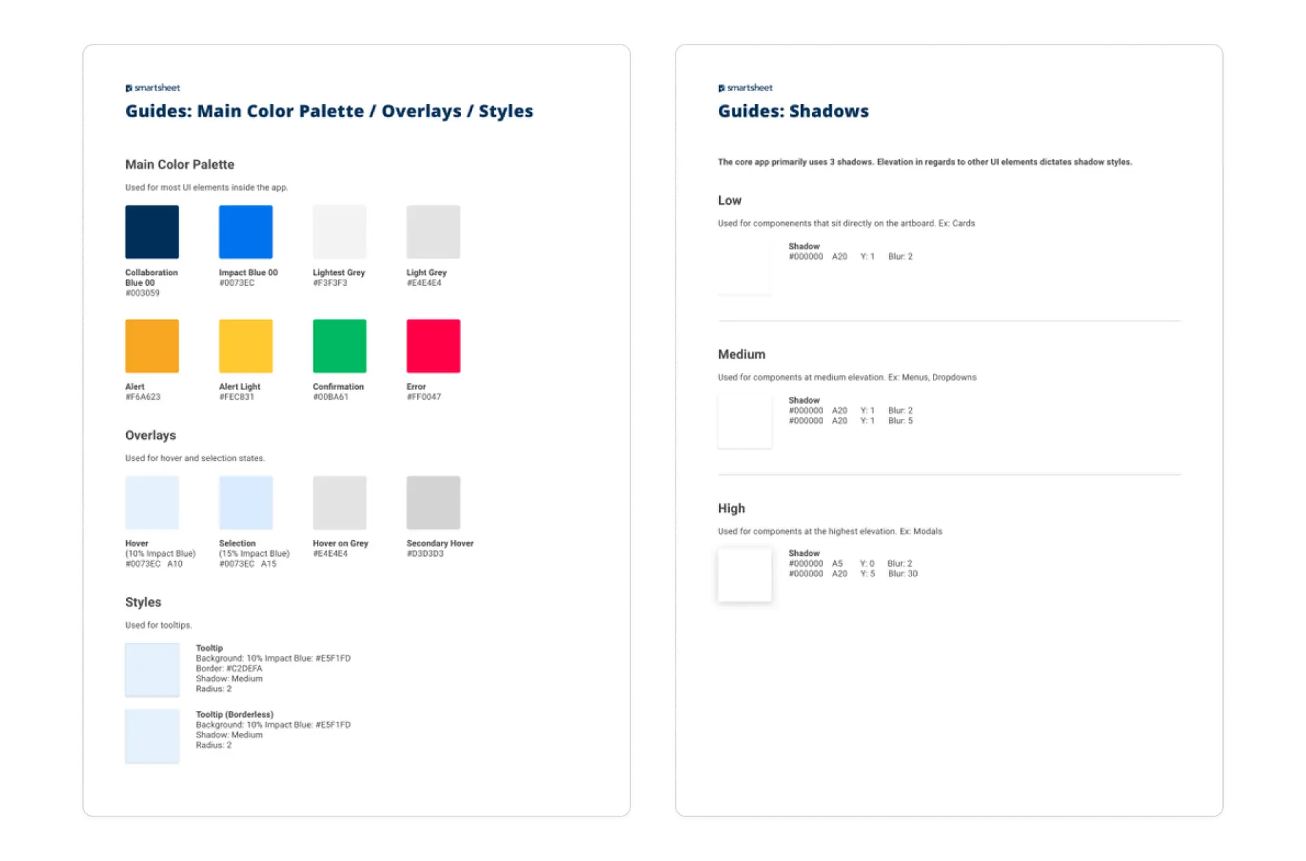
That’s why I created Guides and Gallery (see examples below). It reduced the number of basic questions that I used to get on a daily basis to almost 0.
I partnered with our UX writer to write the Guides as well as the writing guidelines. He was also pleased to get significantly less basic UX writing questions come his way.
Lastly, and not the least, I teamed up with a team of developers in charge of implementing the design system in code. Together, we collaborated on fine-tuning and scaling the system using Storybook.
A design system is an incredible source of truth.
Scaling design for the entire org
What was a solo side project, ended up impacting the entire org in a meaningful way. It was a game changer:
Style guide
2-6x fewer color tokens (e.g. 60+ grays to just 10)
From 50+ font styles down to 15 simplifying everyone’s decision process
Newly redesigned vector icons replaced a set of outdated PNGs (!!) icons
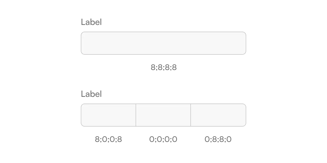
From undefined to unified and scalable spacing strategy
From dozens of shadow styles down to 3
Component library
Designers designed 2-3x faster and more cohesively
Daily component questions went from a LOT, down to almost 0
From unscalable one-off components to reusable ones
Guides & education
Daily basic UX writing questions reduced dramatically
Daily basic style guide questions reduced to almost 0
Back and forth between designers and devs reduced drastically
Design reviews were introduced to educate further on patterns
"Ludovic, thank you for this really valuable contribution to our team's ability to deliver great design more efficiently and easily.
I especially want to recognize some aspects of how you went about this:
First, we weren't sure that this was a project that could be delivered in the six weeks we asked you to spend on it. The fact is, you delivered more than was expected, and got it done before the deadline. That's not what usually happens in the software world :-)
Second, you brought a high level of thought and mastery to the task, getting the most out of Sketch to make this component library into an easy-to-use and highly functional resource for all of us. The craft and quality is excellent.
Finally, you worked collaboratively with key stakeholders AND did the independent thinking to come up with a good, flexible system the we can build upon. Well done!”
Aaron Tinling - Principal UX Design Manager @Smartsheet
Thank yous 💌
The design system effort was a massive team effort.
Big congrats and thank you to everyone involved:
Kit Unger, Aaron Tinling, Tony Yates, Phillip Gockel, Jeanette Huang, Jason King, Eugene Gershnik, Branton Boehm, Lada Gorlenko, Sam Swenson, John Marshall, Dave Andrey, and everyone else would helped along the way.
