SMARTSHEET
From outdated to world-class mobile spreadsheet experience
Before the redesign, the mobile spreadsheet was unintuitive and slow. Users struggled to edit on the go, reducing their productivity. After the redesign, usability metrics improved significantly with key interactions increasing by up to 41%.
Mobile design
Full revamp
ROLE
Product Designer
YEAR
2017-2018
TEAM
Product Manager
Fullstack & QA Engineers
UX Researcher
UX Intern
→ 89% adoption rate in the first month
Users quickly abandoned their old habits for editing spreadsheets in favor of the new experience.
→ 93% average completion rate
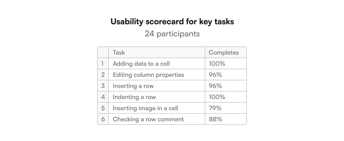
Key tasks like adding data to a cell, editing column properties, etc. achieved high completion rates in the mobile scorecard study.
→ 16-41% boost in key interactions
2 months post release, interactions with comments increased by 41% while the number of attachments viewed jumped 16%.
"Making updates is much quicker now with the Smartsheet mobile application. Features are intuitive to use, so I'm excited to do more of my work on mobile."
David Domine - VP Technology
The app needed an overhaul—yesterday
When I joined the team, the spreadsheet experience was in bad shape. It was hard to use: the information architecture was a mess and the interactions were confusing. Users struggled to complete daily tasks on the go:
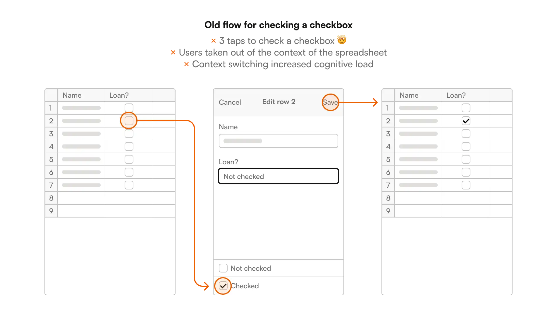
Editing spreadsheet data was slow, and it took users out of the context of the spreadsheet (see illustration below ↓).
Cell, row, and column actions were unintuitive, making simple tasks a usability nightmare.
Strategic vision: On-the-go productivity
The goal was to make Smartsheet's mobile app a powerful tool for users to stay productive anywhere. We aimed to set a new standard for what customers could accomplish on the go.
Competitors offered better experiences, and a major revamp was essential to increase engagement and reduce churn.
No time to waste
The situation was dire—like no caffeine on a Monday. ☕
This was going to be the most complex project I ever worked on. It was also the most fun one, thanks to awesome teammates.
We pulled up our sleeves began a 1-year journey to save the app!
Early mixed signals
We knew that users struggled. Completing simple tasks was tedious and time-consuming. Customers kept bringing back the same request:
“I would like the cell editing while still on the sheet! That would be a game changer.”
Customer
“I really want in-line editing! Especially for a 'Done' checkbox column.”
Customer
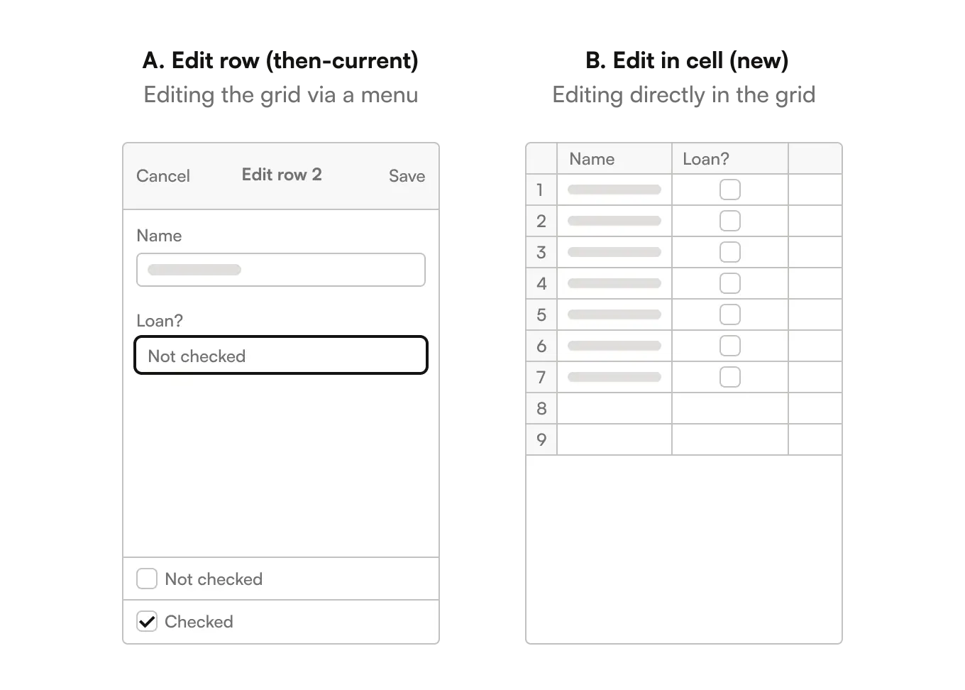
A survey was sent to 140 customers and non-customer, asking for preferences between two versions, ‘Edit row’ and ‘Edit in cell’:
Surprisingly, it wasn’t conclusive (🧐):
But we were aware of the big limitations in sending static images in a survey and asking people to choose.
We needed to investigate this further.
MVP testing: A step forward
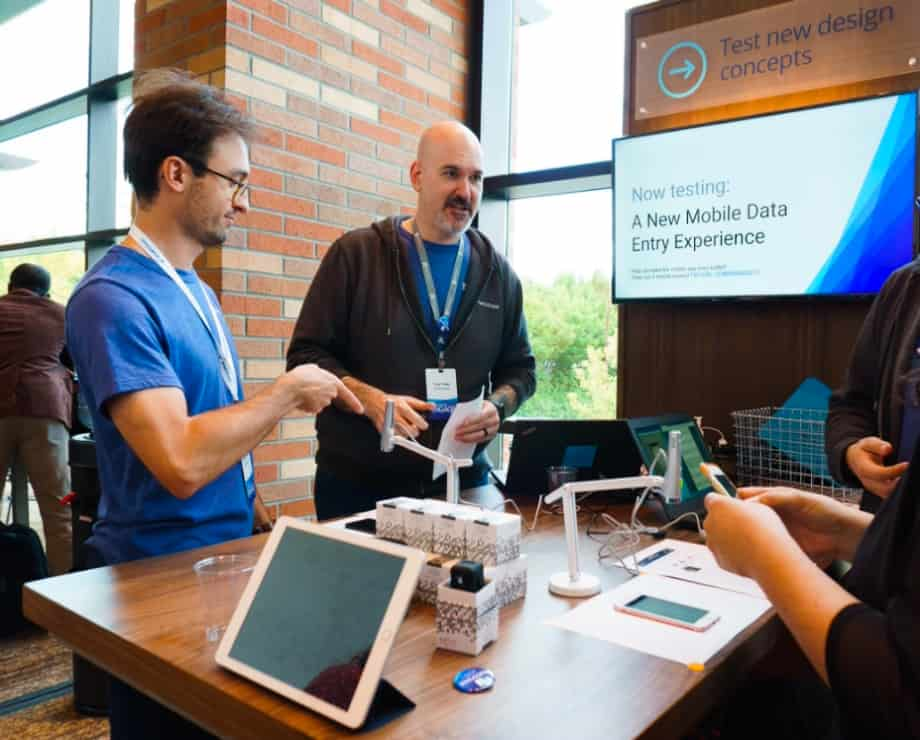
Smartsheet was hosting it’s annual conference—AKA, the dream opportunity to test our early MVP with customers.
I worked on a usability test script with our UX researcher and created an interactive prototype to test with customers who use the mobile app.
The goal was to understand:
User sentiment for ‘edit row’ (then-current) vs. ‘edit in cell’ (new)
Relevancy and usability of the new ‘edit in cell’ MVP experience
Our concepts, prototype and script had to be built in 3 weeks.
Finally, it was conference day! Woke up, slugged down a coffee (I don’t even like coffee!), and headed out to the conference center.
By the afternoon, we conducted 31 usability tests.
And a few days later, the results came in:
The insights were clear:
The appeal for ‘Edit row’ (then-current) declined sharply.
Customers were excited about the ‘Edit in cell’ (new) vision, but still wanted both options, as the MVP was too basic.
It was a step in the right direction! 😎
Guerrilla testing to deepen our insights
While customers liked some aspects of the MVP, to truly nail it we needed a broader understanding of the competitive landscape.
We needed to determine what works well and what doesn’t in similar apps like Microsoft Excel, Google Sheets, and Apple Numbers.
So we ran a competitive analysis and conducted guerrilla testing with a bunch of participants at nearby coffee shops.
The findings were invaluable:
Data entry at the top of the sheet, like Excel, is the least discoverable
A keyboard button is easy for participants to understand and use
All apps have an “annoying” tool grid pop up (for cell actions)
Participants expect to check a box with one tap
Participants expect auto-save
We knew what to emulate and what to avoid. 🏄♂️
Core experience: 93% avg completion rate
For months, I prototyped, tested, repeated.
At this stage, our goal was to design a solid core experience. By January 2018, key tasks were mostly on track:
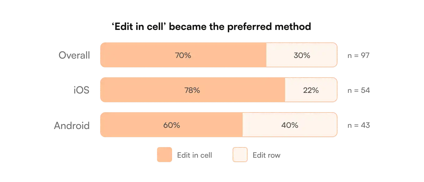
And as the designs improved, customer preference for ‘edit in cell’ kept on growing:
The preference for ‘Edit in cell’ jumped from 33% (MVP) to 70%. The team was proud of the progress.
Perfecting the end-to-end experience
Now that the core experience was under control, we had to finesse everything in 4 key pillars:
Edit/select mode experience details
Cell, row, column toolbars
Sheet-level actions
Saving errors and data validation handling
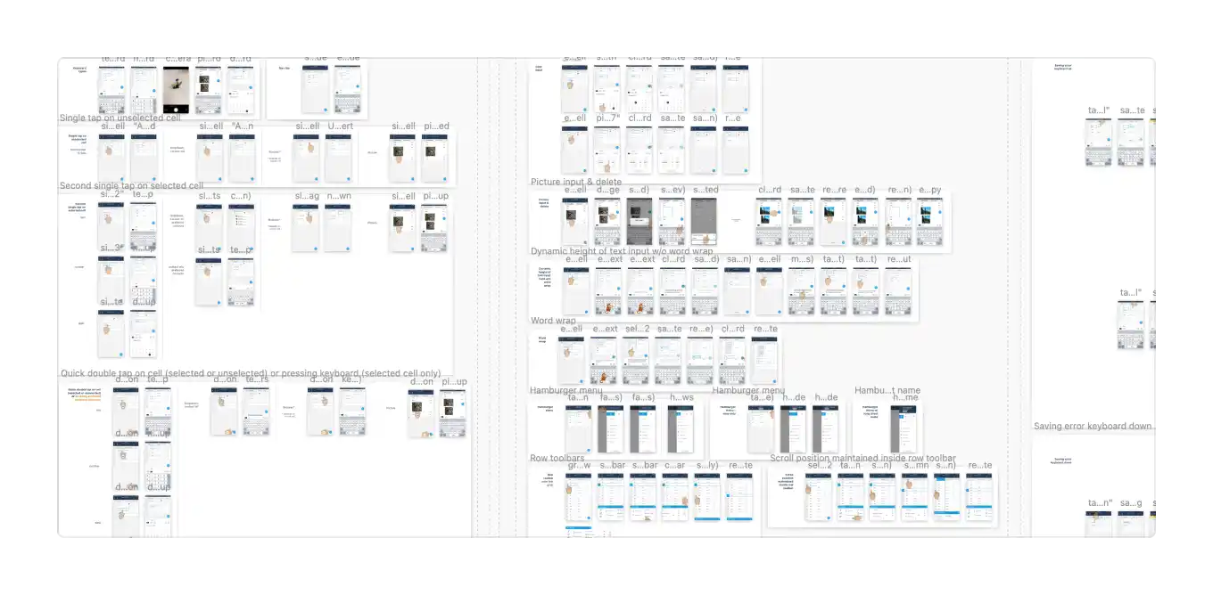
It took 1,150 frames! 😮 iOS: 381 | iPad: 404 | Android: 365
As the legacy mobile apps were crippled with one-off UI decisions, I took the opportunity to kickstart a design system effort and deliver a cohesive end-to-end experience:
Simplified the style guide (e.g., cutting down 60+ shades of gray to just 10) and reduced excessive type ramps and shadow styles.
Created a consistent set of reusable components, ensuring the component library was scalable and easy to maintain.
Read the full design system case study here.
The team looked at all the edge cases and made sure everything worked smoothly across iOS, Android, and tablets. By prototyping interactions across these platforms, the experience was consistent.
We were ready for a soft launch.
BETA launch was a big win
After months of work, a segment of early adopters got their hands on the BETA—they got access to it for a full month.
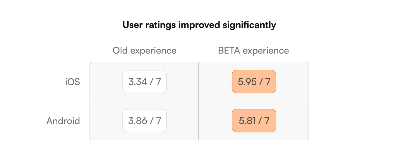
Their excitement was real, and so was their ratings:
I worked closely with my PM and developers to squash bugs that impacted the user experience and addressed BETA user feedback.
Although it wasn’t a perfect 7 out of 7, the great news is that most of the lower scores were due to areas outside the project’s scope: Lack of native Forms, poor Card view and Home experience.
We were confident the app was ready.
THE APP IS LIVE! 🎉
The team worked really hard and we were so excited for customers to try the new experience!
SOLUTION 1
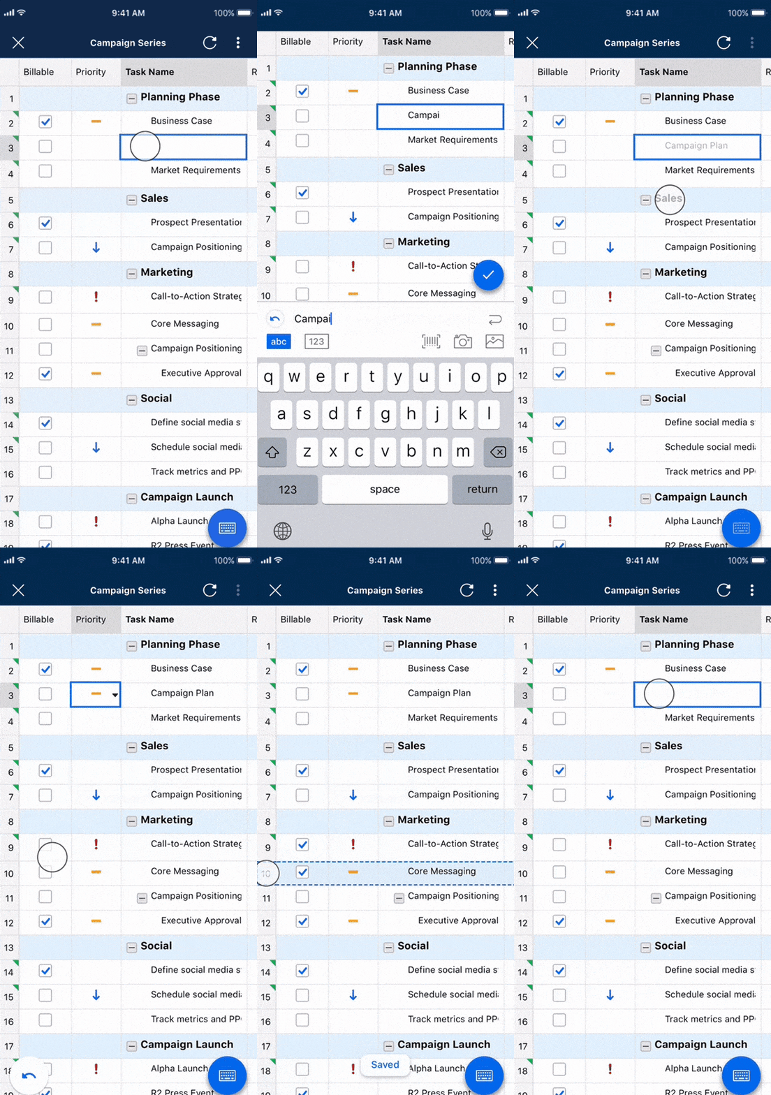
New editing experience
Editing
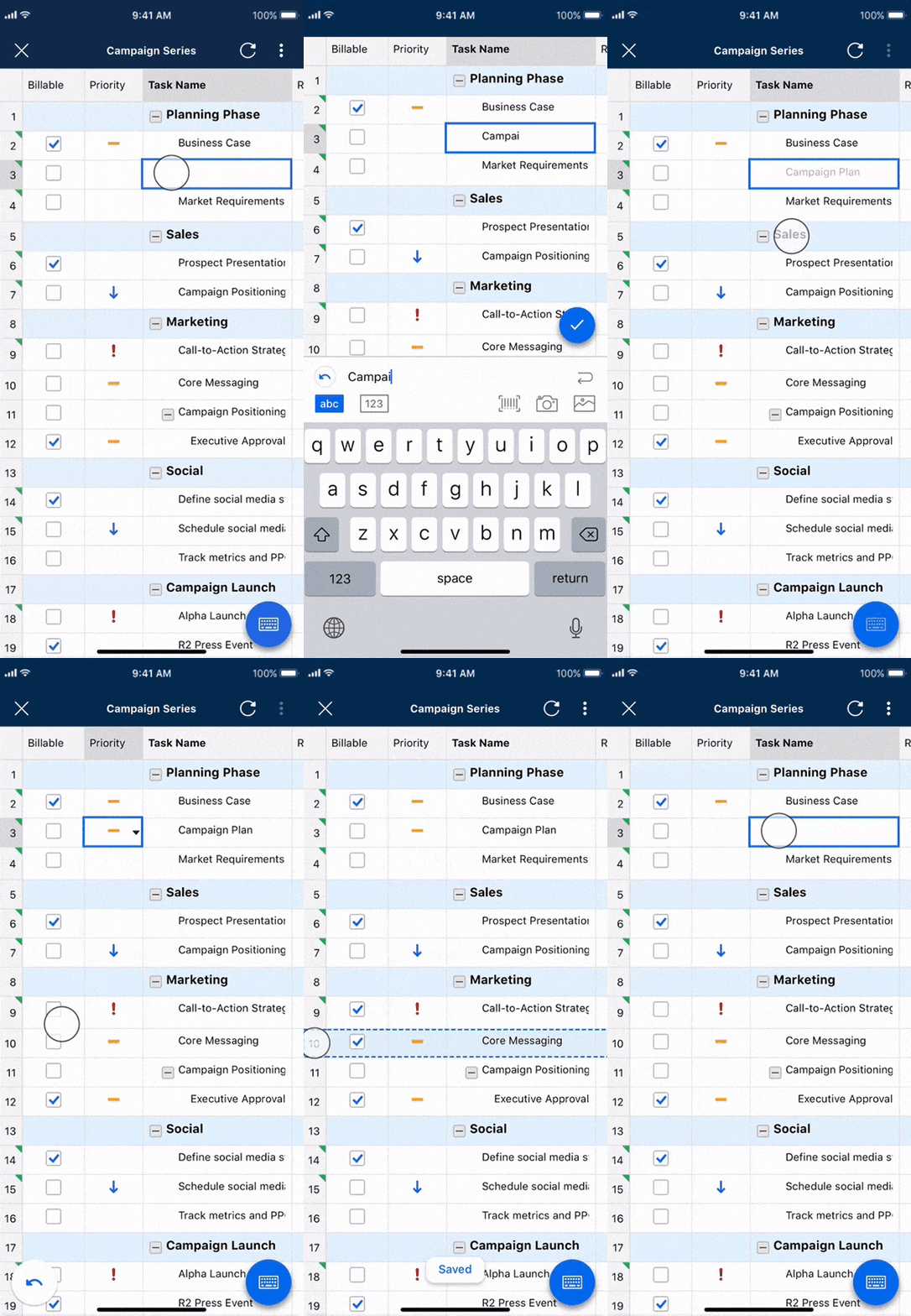
2-8x faster editing—no more screen switching
Always in context of the grid instead of in a row menu
Reduced cognitive load by staying in the grid experience
Booleans (flag, star, checkbox)
8x faster than before
1 tap instead of 3 taps
Actionable on edit + select mode instead of just edit mode
Modes & interactions
Select mode to view data (previously, didn’t exist)
Edit mode to edit data (previously, took users out of the grid)
1-tap on a cell doesn’t force users to enter edit mode anymore
SOLUTION 2
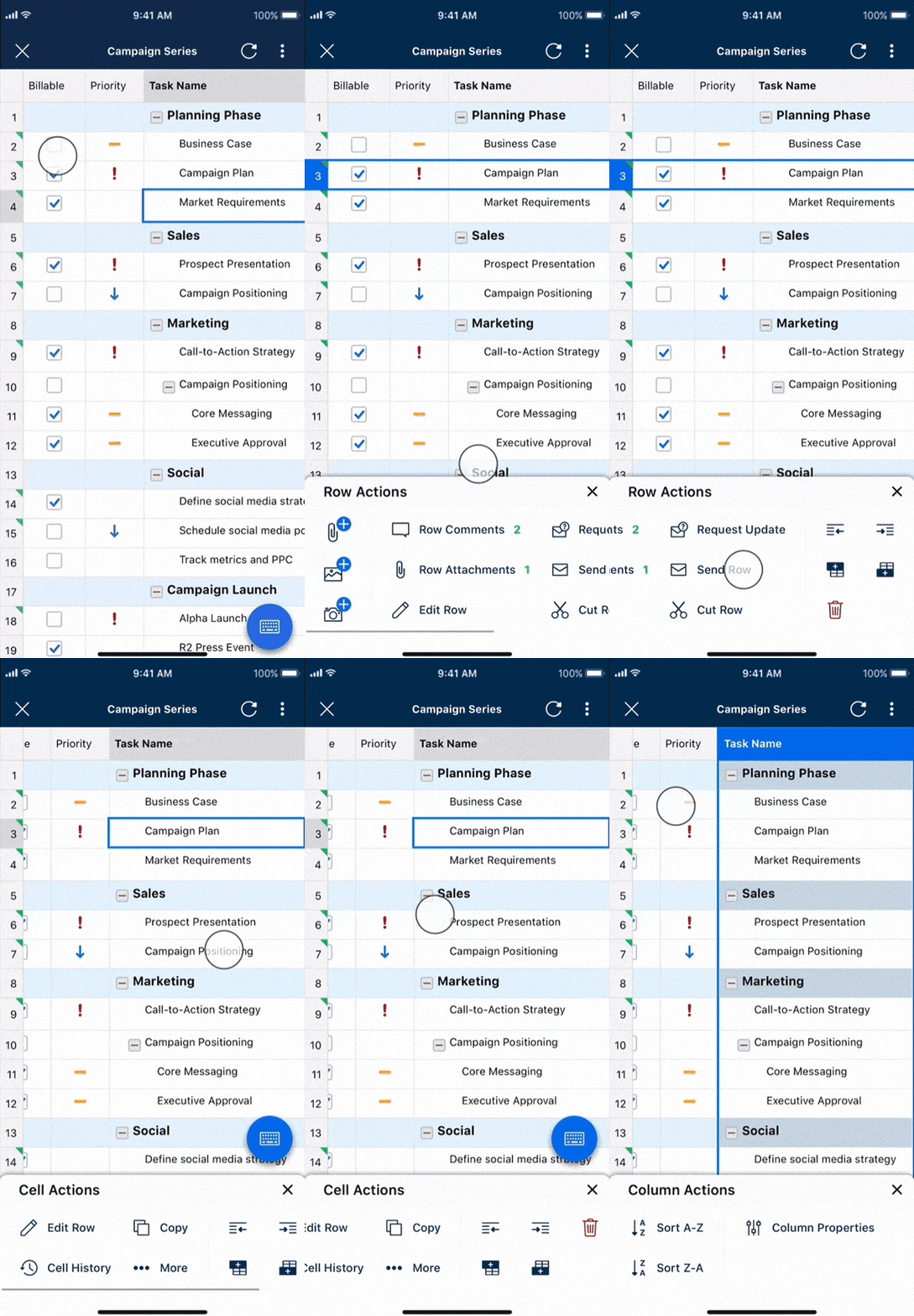
New toolbars
Toolbars
2 months post release, interactions with comments increased by 41% while the number of attachments viewed jumped by 16%
Cell toolbar
New ‘Modify’ actions (Copy, Paste) didn’t exist on mobile
New ‘Insert’ actions (Image, Link, etc.) didn’t exist on mobile
Row toolbar
Always accessible instead of in the first unfrozen column
All row actions are in 1 menu instead of 2 separate menus
Column toolbar
New actions (Sort, Lock, Hide) didn’t exist on mobile
New column resizing didn’t exist on mobile
SOLUTION 3
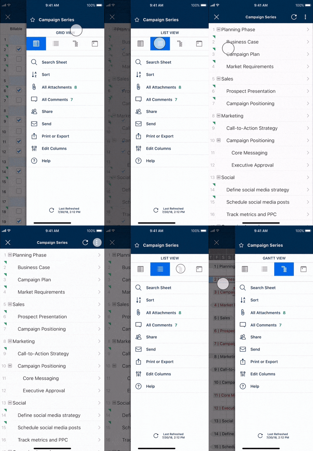
Sheet actions
Improved IA
Sheet actions combined in 1 menu instead of 4 disparate locations
The sheet menu is only composed of sheet-level actions instead of sheet, row, and column actions
Thank yous 💌
The yearlong redesign was a huge team effort.
Big congrats and thank you to everyone involved:
Kit Unger, Tony Yates, Jeanette Huang, Eugene Gershnik, Branton Boehm, Lada Gorlenko, Ian Wyosnick, Chandler Tsai, John Marshall, Imanuel Chen, Vincent Che, Aidan Low, Paul Schmidt, Nicole Richards, Naomi Flatman, Wes Winn, Viradeth Xay-Ananh, Alexey Sazonov, Dave Andrey, Wallace Bunn, Grant Jaquish, Anthony Bryan, Jeffrey Rezendes, and anyone I may have forgotten.
